Amazon Redshift + R: Analytics Flow

Ok, so it’s a slightly fanboy-ish title but I’m starting to really like the early experimentation we’ve been doing with Amazon’s Redshift service at uSwitch.

Our current data platform is a mix of Apache Kafka, Apache Hadoop/Hive and a set of heterogenous data sources mixed across the organisation (given we’re fans of letting the right store find it’s place).

The data we ingest is reasonably sizeable (gigabytes a day); certainly enough to trouble the physical machines uSwitch used to host with. However, for nearly the last 3 years we’ve been breaking uSwitch’s infrastructure and systems apart and it’s now much easier to consume whatever resources you need.

Building data systems on immutable principles also makes this kind of experimentation so much easier. For a couple of weeks we (Paul and I) have been re-working some of our data warehousing ETL to see what a Redshift analytics world looks like.

Of course it’s possible to just connect any JDBC SQL client to Redshift but we want to be able to do some more interactive analysis on the data we have. We want an Analytics REPL.

Redshift in R

I’m certainly still a novice when it comes to both statistical analyses and R but it’s something I’m enjoying- and I’m lucky to work with people who are great at both.

R already has a package for connecting to databases using JDBC but I built a small R package that includes both the Postgresql 8.4 JDBC driver and a few functions to make it nicer to interact with: Redshift.R. N.B. this was partly so I could learn about writing R packages, and partly about making it trivial for other R users in the company to get access to our experimental cluster.

The package is pretty easy to install- download the tarball, uncompress and run an R statement. The full instructions are available on the project’s homepage. Once you’ve installed it you’re done- no need to download anything else.

Flow

What I found really interesting, however, was how I found my workflow once data was accessible in Redshift and directly usable from inside my R environment; the 20 minute lead/cycle time for a Hive query was gone and I could work interactively.

I spent about half an hour working through the following example- it’s pretty noddy analytics but shows why I’m starting to get a little excited about Redshift: I can work mostly interactively without needing to break my work into pieces and switch around the whole time.

Disclosure

It would be remiss of me not to mention that R already has packages for connecting to Hadoop and Hive, and work to provide faster querying through tools like Cloudera’s Impala. My epiphany is probably also very old news to those already familiar with connecting to Vertica or Teradata warehouses with ODBC and R. 

The killer thing for me is that it cost us probably a few hundred dollars to create a cluster with production data in, kick the tyres, and realise there’s a much better analytics cycle for us out there. We're really excited to see where this goes.

Analysing and predicting performance of our Neo4j Cascading Connector with linear regression in R

As I mentioned in an earlier article, Paul and I have produced a library to help connect Cascading and Neo4j making it easy to sink data from Hadoop with Cascading flows into a Neo4j instance. Whilst we were waiting for our jobs to run we had a little fun with some regression analysis to optimise the performance. This post covers how we did it with R.

I’m posting because it wasn’t something I’d done before and it turned out to be pretty good fun. We played with it for a day and haven’t done much else with it since so I’m also publishing in case it’s useful for others.

We improved the write performance of our library by adding support for batching- collecting mutations into sets of transactions that are batched through Neo4j’s REST API. This improved performance (rather than using a request/response for every mutation) but also meant we needed to specify a chunk size; writing all mutations in a single transaction would be impossible.

There are 2 indepent variables that we could affect to tweak performance: the batch size and the number of simultaneous connections that are making those batch calls. N.B this assumes any other hidden factors remain constant.

For us, running this on a Hadoop cluster, these 2 variables determine the batch size in combination with the number of Hadoop’s reduce or map tasks concurrently executing.

We took some measurements during a few runs of the connector across our production data to help understand whether we were making the library faster. We then produced a regression model from the data and use the optimize function to help identify the sweet spot for our job’s performance.

We had 7 runs on our production Hadoop cluster. We let the reduce tasks (where the Neo4j write operations were occurring) run across genuine data for 5 minutes and measured how many nodes were successfully added to our Neo4j server. Although the cluster was under capacity (so the time wouldn’t include any idling/waiting) our Neo4j server instance runs on some internal virtualised infrastructure and so could have exhibited variance beyond our changes.

The results for our 7 observerations are in the table below:

Test No. Number of Reducers Batch Size Nodes per minute
1 1 10 5304.4
2 4 10 13218.8
3 4 20 13265.636
4 8 5 11289.2
5 8 10 17682.2
6 16 10 20984.2
7 8 20 20201.6

Regression in R

A regression lets us attempt to predict the value of a continuous variable based upon the value of one or more other independent variables. It also lets us quantify the strength of the relationship between the dependent variable and independent variables.

Given our experiment, we could determine whether batch size and the number of reducers (the independent variables) affected the number of Neo4j nodes we could create per minute (the dependent variable). If there was, we would use values for those 2 variables to predict performance.

The first stage is to load the experiment data into R and get it into a data frame. Once we’ve loaded it we can use R’s lm function to fit a linear model and look at our data.

In the above, the formula parameter to lm lets us describe that nodes.per.minute is our dependent variable (our outcome), and reducers and batch.size are our independent variables (our predictors).

Much like other analysis in R, the first thing we can look at is a summary of this model, which produces the following:

lm(formula = nodes.per.minute ~ reducers + batch.size, data = results)

Residuals:
    1     2     3     4     5     6     7 
-2330  2591 -1756 -1135  3062 -1621  1188 

Coefficients:
            Estimate Std. Error t value Pr(>|t|)  
(Intercept)   2242.8     3296.7   0.680   0.5336  
reducers       998.1      235.6   4.236   0.0133 *
batch.size     439.3      199.3   2.204   0.0922 .
---
Signif. codes:  0 ‘***’ 0.001 ‘**’ 0.01 ‘*’ 0.05 ‘.’ 0.1 ‘ ’ 1 

Residual standard error: 2735 on 4 degrees of freedom
Multiple R-squared: 0.8362, Adjusted R-squared: 0.7543 
F-statistic: 10.21 on 2 and 4 DF,  p-value: 0.02683

The summary data tells us that the model supports the data relatively well. Our R-squared is 0.075 and both batch size and reducer size are considered significant.

But, what if we tweak our model? We suspect that the shape of the performance through increasing reducers and batch size is unlikely to exhibit linear growth. We can change the formula of our model and see whether we can improve the accuracy of our model:

And let’s the the results of calling summary(model):

Call:
lm(formula = nodes.per.minute ~ reducers + I(reducers^2) + batch.size + 
    I(batch.size^2), data = results)

Residuals:
         1          2          3          4          5          6          7 
-2.433e+02  9.318e+02 -3.995e+02  9.663e-13 -7.417e+02  5.323e+01  3.995e+02 

Coefficients:
                 Estimate Std. Error t value Pr(>|t|)  
(Intercept)     -15672.16    3821.48  -4.101   0.0546 .
reducers          2755.10     337.07   8.174   0.0146 *
I(reducers^2)     -101.74      18.95  -5.370   0.0330 *
batch.size        2716.07     540.07   5.029   0.0373 *
I(batch.size^2)    -85.94      19.91  -4.316   0.0497 *
---
Signif. codes:  0 ‘***’ 0.001 ‘**’ 0.01 ‘*’ 0.05 ‘.’ 0.1 ‘ ’ 1 

Residual standard error: 948.6 on 2 degrees of freedom
Multiple R-squared: 0.9901, Adjusted R-squared: 0.9704 
F-statistic: 50.25 on 4 and 2 DF,  p-value: 0.01961

Our R-squared is now 0.9704- our second model fits the data better than our first model.

Optimization

Given the above, we’d like to understand the values for batch size and number of reducers that will give us the highest throughput.

R has an optimize function that, given a range of values for a function parameter, returns the optimal argument for the return value.

We can create a function that calls predict.lm with our model to predict values. We can then use the optimize function to find our optimal solution:

We use a set batch size of 20 and optimize to discover that the optimal number of reducers is 13 with a throughput of 22,924 nodes/minute. The second command optimizes for batch size with a fixed number of reducers. Again, it suggests a batch size of 15 for an overall throughput of 24,409 nodes/minute.

This supports what we observed earlier with the summary data: number of reducers is more significant than batch size for predicting throughput.

I’m extremely new to most of R (and statistics too if I’m honest- the last year is the most I’ve done since university) so if anyone could tell me if there’s a way to perform an optimization for both variables that would be awesome.

Please note this post was more about our experimentation and the process- I suspect our data might be prone to systematic error and problems because we only have a few observations. I’d love to run more experiments and get more measurements but we moved on to a new problem :)
Evaluating classifier results with R part 2

In a previous article I showed how to visualise the results of a classifier using ggplot2 in R. In the same article I mentioned that Alex, a colleague at Forward, had suggested looking further at R’s caret package that would produce more detailed statistics about the overall performance of the classifer and within individual classes.

Confusion Matrix

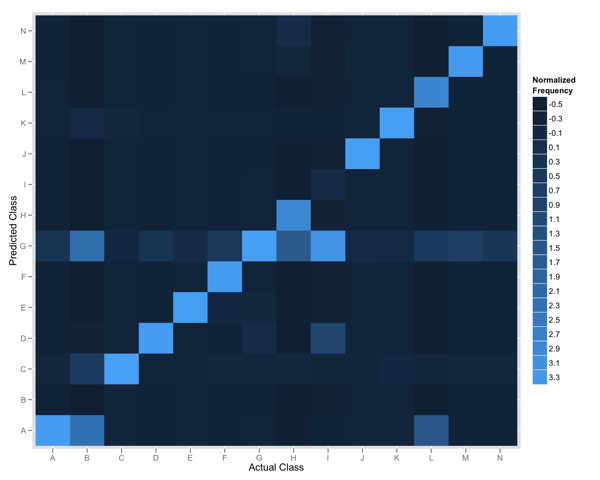
Using ggplot2 we can produce a plot like the one below: a visual representation of a confusion matrix. It gives us a nice overview but doesn’t reveal much about the specific performance characteristics of our classifier.

To produce our measures, we run our classifier across a set of test data and capture both the actual class and the predicted class. Our results are stored in a CSV file and will look a little like this:

actual, predicted
A, B
B, B,
C, C
B, A

Analysing with Caret

With our results data as above we can run the following to produce a confusion matrix with caret:

results.matrix now contains a confusionMatrix full of information. Let’s take a look at some of what it shows. The first table shows the contents of our matrix:

Reference
Prediction              A     B     C     D
A                     211   3     1     0
B                     9     26756 6     17
C                     1     12    1166  1
D                     0     18    3     1318

Each column holds the reference (or actual) data and within each row is the prediction. The diagonal represents instances where our observation correctly predicted the class of the item.

The next section contains summary statistics for the results:

Overall Statistics

                     Accuracy : 0.9107          
                       95% CI : (0.9083, 0.9131)
          No Information Rate : 0.5306          
          P-Value [Acc > NIR] : < 2.2e-16

Overall accuracy is calculated at just over 90% with a p-value of 2 x 10^-16, or 0.00000000000000022. Our classifier seems to be doing a pretty reasonable job of classifying items.

Our classifier is being tested by putting items into 1 of 13 categories- caret also produces a final section of statistics for the performance of each class.

Class: A        Class: B  ...   Class: J
Sensitivity             0.761733        0.9478          0.456693
Specificity             0.998961        0.9748          0.999962
Pos Pred Value          0.793233        0.9770          0.966667 
Neg Pred Value          0.998753        0.9429          0.998702
Prevalence              0.005206        0.5306          0.002387
Detection Rate          0.003966        0.5029          0.001090
Detection Prevalence    0.005000        0.5147          0.001128

The above shows some really interesting data.

Sensitivity and specificity respectively help us measure the performance of the classifier in correctly predicting the actual class of an item and not predicting the class of an item that is of a different class; it measures true positive and true negative performance.

From the above data we can see that our classifier correctly identified class B 94.78% of the time. That is, when we should have predicted class B we did. Further, when we shouldn’t have predicted class B we didn’t for 97.48% of examples. We can contrast this to class J: our specificity (true negative) is over 99% but our sensitivity (true positive) is around 45%; we do a poor job of positively identifying items of this class.

Caret has also calculated a prevalence measure- that is, of all observations, how many were of items that actually belonged to the specified class; it calculates the prevalence of a class within a population.

Using the previously defined sensitivity and specificity, and prevalance measures caret can calculate Positive predictive value and Negative predictive value. These are important as they reflect the probability that a true positive/true negative is correct given knowledge about the prevalence of classes within the population. Class J has a positive predictive value of over 96%: despite our classifier only being able to positively identify objects 45% of the time there’s a 96% chance that, when it does, such a classification is correct.

The caret documentation has some references to relevant papers discussing the measures it calculates.

Visualising classifier results with R and ggplot2

Earlier in the year, myself and some colleagues started working on building better data processing tools for uSwitch.com. Part of the theory/reflection of this is captured in a presentation I was privileged to give at EuroClojure (titled Users as Data).

In the last few days, our data team (Thibaut, Paul and I) have been playing around with some of the data we collect and using it to build some classifiers. Precision and Recall provide quantitative measures but reading through Machine Learning for Hackers showed some nice ways to visualise results.

Binary Classifier

Our first classifier attempted to classify data into 2 groups. Using R and ggplot2 I produced a plot (similar to the one presented in the Machine Learning for Hackers book) to show the results of the classifier.

Our results were captured in a CSV file and looked a little like this:

A,0.25,0.15
A,0.2,0.19
B,0.19,0.25

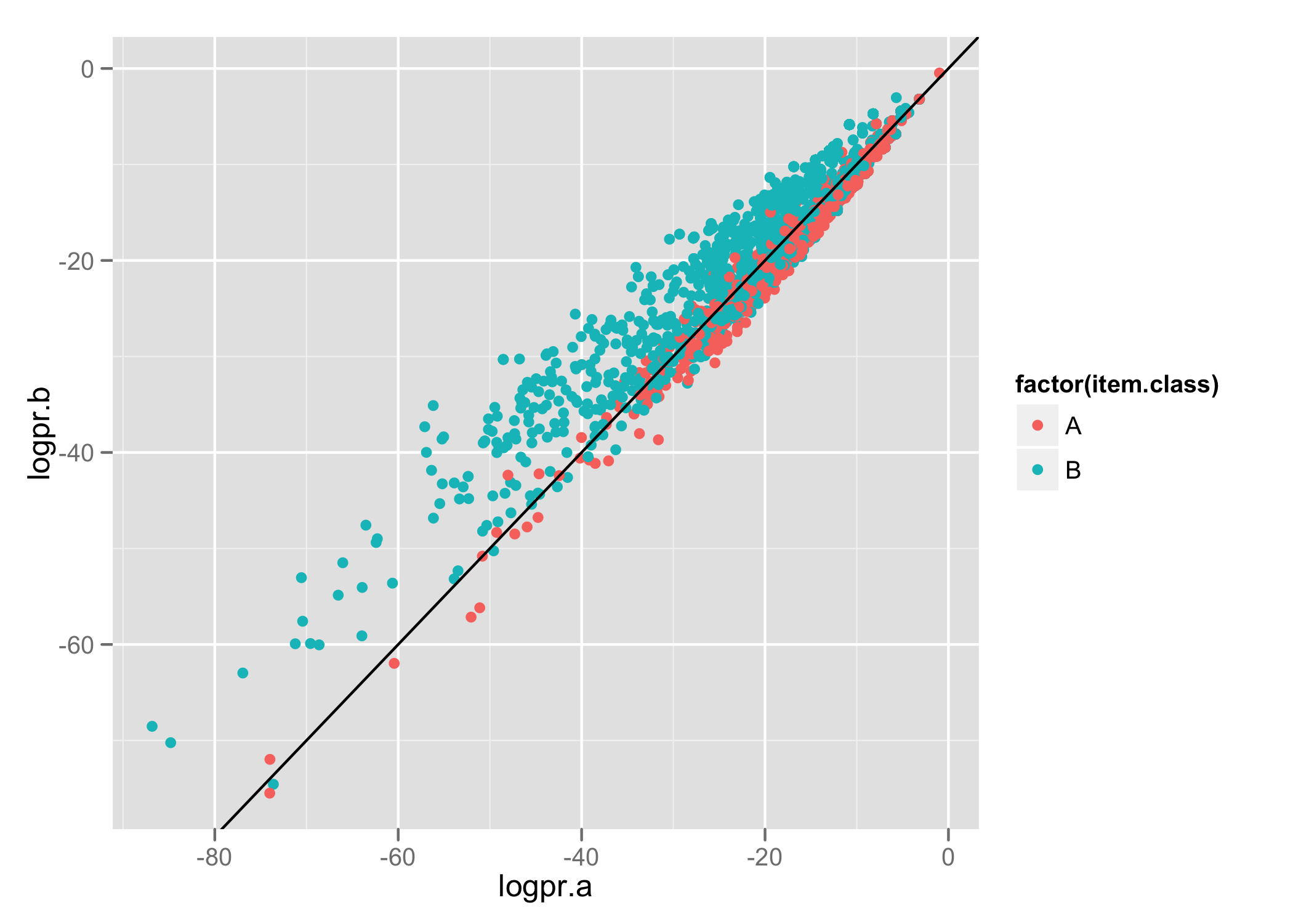
Each line contains the item's actual class, the predicted probability for membership of class A, and the predicted probability for membership of class B. Using ggplot2 we produce the following:

binary classification plot

Items have been classified into 2 groups- A and B. The axis show the log probability (we’re using Naive Bayes to classify items) that the item belongs to the specified class. We use colour to identify the actual class for items and draw a line to represent the decision boundary (i.e. which of the 2 classes did our model predict).

This lets us nicely see the relationship between predicted and actual classes.

We can see there’s a bit of an overlap down the decision boundary line and we’re able to do a better job for classifying items in category B than A.

The R code to produce the plot above is as follows. Note that because we had many millions of observations I randomly sampled to make it possible to compute on my laptop :)

More Classes!

But what if we want to see compare the results when we’re classifying items into more than 1 group?

After chatting to Alex Farquhar (another data guy at Forward) he suggested plotting a confusion matrix.

Below shows the plot we produced that compares the actual and predicted classes for 14 items.

The y-axis shows the predicted class for all items, and the x-axis shows the actual class. The tiles are coloured according to the frequency of the intersection of the two classes thus the diagonal represents where we predict the actual class. The colour represents the relative frequency of that observation in our data; given some classes occur more frequently we normalize the values before plotting.

Any row of tiles (save for the diagonal) represents instances where we falsely identified items as belonging to the specified class. In the rendered plot we can see that items in Class G were often identified for items belonging to all other classes.

Our input data looked a little like this:

1,0,0
0,3,0
1,0,2

It’s a direct encoding of our matrix- each column represents data for classes A to N, and each row represents data for classes A to N. The diagonal holds data for A,A, B,B, etc.

The R code to plot the confusion matrix is as follows:

Alex also suggested using the caret package which includes a function to build the confusion matrix from observations directly and also provides some useful summary statistics. I’m going to hack on our classifier’s Clojure code a little more and will be sure to post again with the findings!