Evaluating classifier results with R part 2

In a previous article I showed how to visualise the results of a classifier using ggplot2 in R. In the same article I mentioned that Alex, a colleague at Forward, had suggested looking further at R’s caret package that would produce more detailed statistics about the overall performance of the classifer and within individual classes.

Confusion Matrix

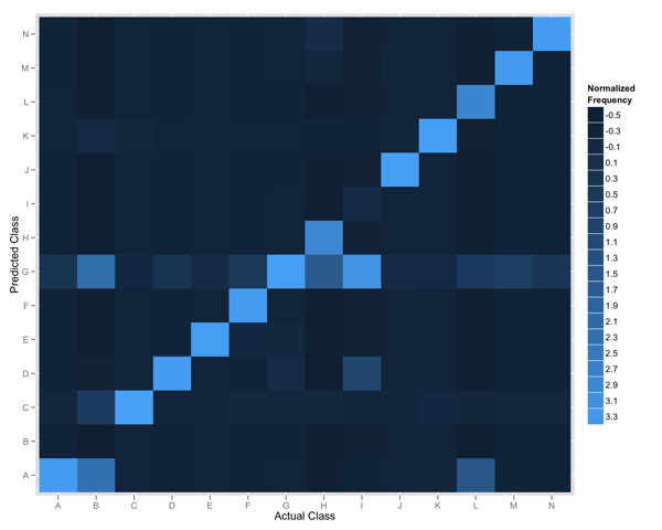
Using ggplot2 we can produce a plot like the one below: a visual representation of a confusion matrix. It gives us a nice overview but doesn’t reveal much about the specific performance characteristics of our classifier.

To produce our measures, we run our classifier across a set of test data and capture both the actual class and the predicted class. Our results are stored in a CSV file and will look a little like this:

actual, predicted
A, B
B, B,
C, C
B, A

Analysing with Caret

With our results data as above we can run the following to produce a confusion matrix with caret:

results.matrix now contains a confusionMatrix full of information. Let’s take a look at some of what it shows. The first table shows the contents of our matrix:

Reference
Prediction              A     B     C     D
A                     211   3     1     0
B                     9     26756 6     17
C                     1     12    1166  1
D                     0     18    3     1318

Each column holds the reference (or actual) data and within each row is the prediction. The diagonal represents instances where our observation correctly predicted the class of the item.

The next section contains summary statistics for the results:

Overall Statistics

                     Accuracy : 0.9107          
                       95% CI : (0.9083, 0.9131)
          No Information Rate : 0.5306          
          P-Value [Acc > NIR] : < 2.2e-16

Overall accuracy is calculated at just over 90% with a p-value of 2 x 10^-16, or 0.00000000000000022. Our classifier seems to be doing a pretty reasonable job of classifying items.

Our classifier is being tested by putting items into 1 of 13 categories- caret also produces a final section of statistics for the performance of each class.

Class: A        Class: B  ...   Class: J
Sensitivity             0.761733        0.9478          0.456693
Specificity             0.998961        0.9748          0.999962
Pos Pred Value          0.793233        0.9770          0.966667 
Neg Pred Value          0.998753        0.9429          0.998702
Prevalence              0.005206        0.5306          0.002387
Detection Rate          0.003966        0.5029          0.001090
Detection Prevalence    0.005000        0.5147          0.001128

The above shows some really interesting data.

Sensitivity and specificity respectively help us measure the performance of the classifier in correctly predicting the actual class of an item and not predicting the class of an item that is of a different class; it measures true positive and true negative performance.

From the above data we can see that our classifier correctly identified class B 94.78% of the time. That is, when we should have predicted class B we did. Further, when we shouldn’t have predicted class B we didn’t for 97.48% of examples. We can contrast this to class J: our specificity (true negative) is over 99% but our sensitivity (true positive) is around 45%; we do a poor job of positively identifying items of this class.

Caret has also calculated a prevalence measure- that is, of all observations, how many were of items that actually belonged to the specified class; it calculates the prevalence of a class within a population.

Using the previously defined sensitivity and specificity, and prevalance measures caret can calculate Positive predictive value and Negative predictive value. These are important as they reflect the probability that a true positive/true negative is correct given knowledge about the prevalence of classes within the population. Class J has a positive predictive value of over 96%: despite our classifier only being able to positively identify objects 45% of the time there’s a 96% chance that, when it does, such a classification is correct.

The caret documentation has some references to relevant papers discussing the measures it calculates.

Visualising classifier results with R and ggplot2

Earlier in the year, myself and some colleagues started working on building better data processing tools for uSwitch.com. Part of the theory/reflection of this is captured in a presentation I was privileged to give at EuroClojure (titled Users as Data).

In the last few days, our data team (Thibaut, Paul and I) have been playing around with some of the data we collect and using it to build some classifiers. Precision and Recall provide quantitative measures but reading through Machine Learning for Hackers showed some nice ways to visualise results.

Binary Classifier

Our first classifier attempted to classify data into 2 groups. Using R and ggplot2 I produced a plot (similar to the one presented in the Machine Learning for Hackers book) to show the results of the classifier.

Our results were captured in a CSV file and looked a little like this:

A,0.25,0.15
A,0.2,0.19
B,0.19,0.25

Each line contains the item's actual class, the predicted probability for membership of class A, and the predicted probability for membership of class B. Using ggplot2 we produce the following:

binary classification plot

Items have been classified into 2 groups- A and B. The axis show the log probability (we’re using Naive Bayes to classify items) that the item belongs to the specified class. We use colour to identify the actual class for items and draw a line to represent the decision boundary (i.e. which of the 2 classes did our model predict).

This lets us nicely see the relationship between predicted and actual classes.

We can see there’s a bit of an overlap down the decision boundary line and we’re able to do a better job for classifying items in category B than A.

The R code to produce the plot above is as follows. Note that because we had many millions of observations I randomly sampled to make it possible to compute on my laptop :)

More Classes!

But what if we want to see compare the results when we’re classifying items into more than 1 group?

After chatting to Alex Farquhar (another data guy at Forward) he suggested plotting a confusion matrix.

Below shows the plot we produced that compares the actual and predicted classes for 14 items.

The y-axis shows the predicted class for all items, and the x-axis shows the actual class. The tiles are coloured according to the frequency of the intersection of the two classes thus the diagonal represents where we predict the actual class. The colour represents the relative frequency of that observation in our data; given some classes occur more frequently we normalize the values before plotting.

Any row of tiles (save for the diagonal) represents instances where we falsely identified items as belonging to the specified class. In the rendered plot we can see that items in Class G were often identified for items belonging to all other classes.

Our input data looked a little like this:

1,0,0
0,3,0
1,0,2

It’s a direct encoding of our matrix- each column represents data for classes A to N, and each row represents data for classes A to N. The diagonal holds data for A,A, B,B, etc.

The R code to plot the confusion matrix is as follows:

Alex also suggested using the caret package which includes a function to build the confusion matrix from observations directly and also provides some useful summary statistics. I’m going to hack on our classifier’s Clojure code a little more and will be sure to post again with the findings!